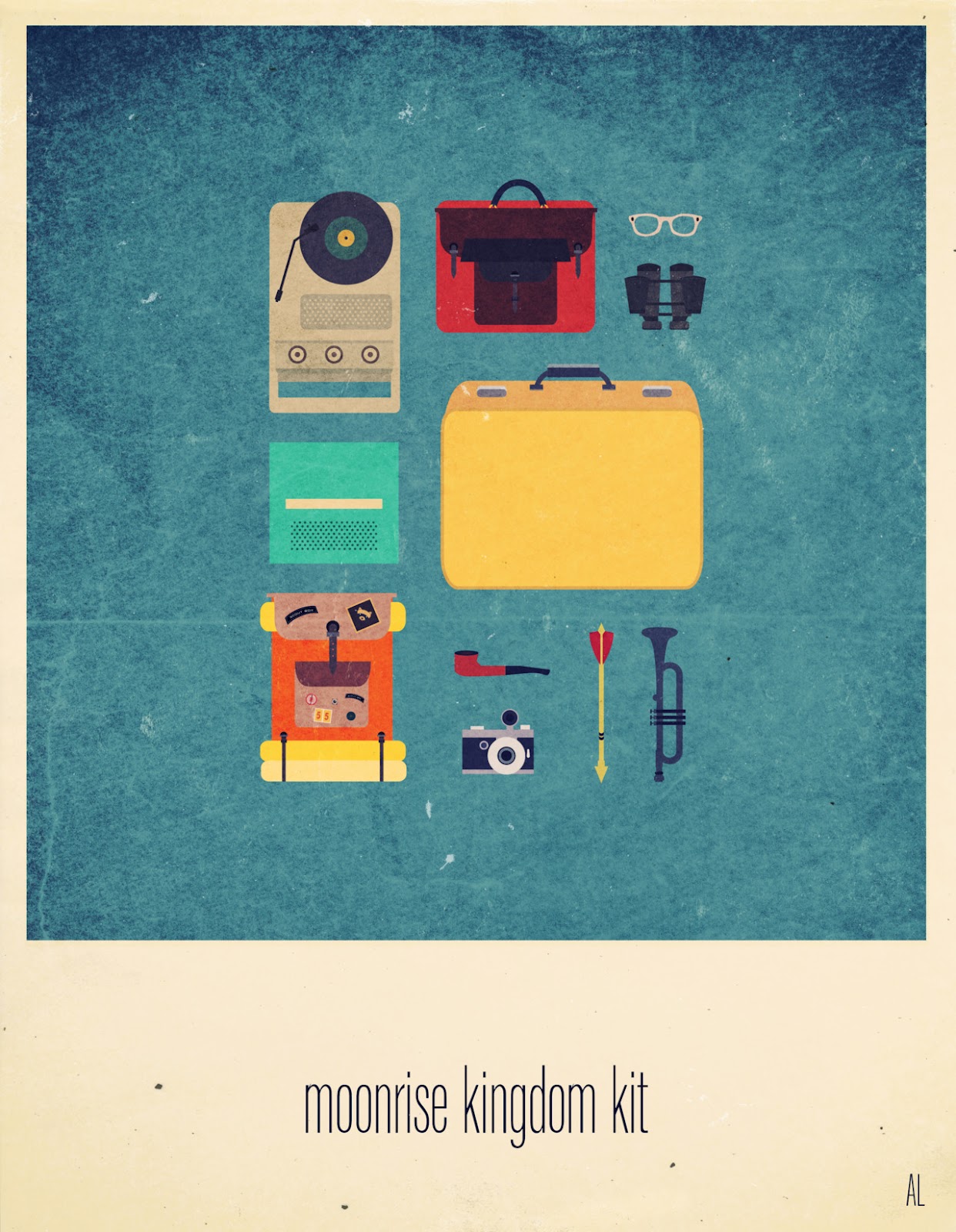
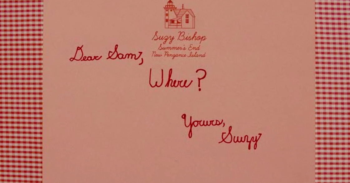
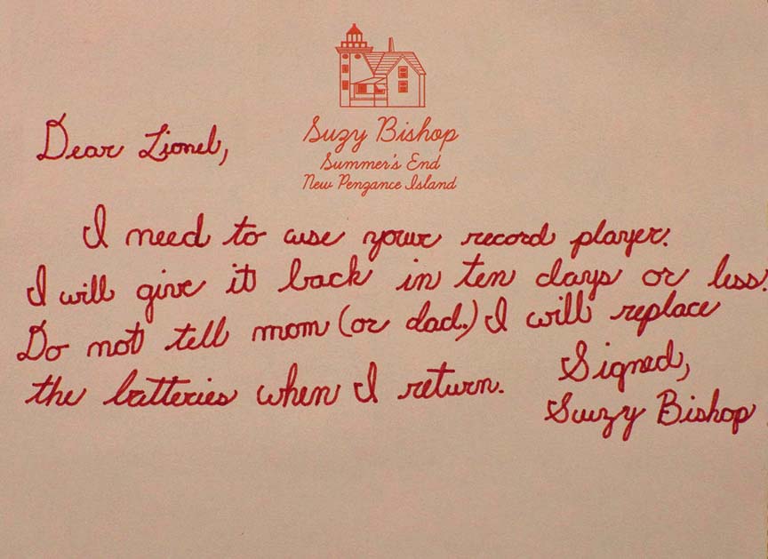
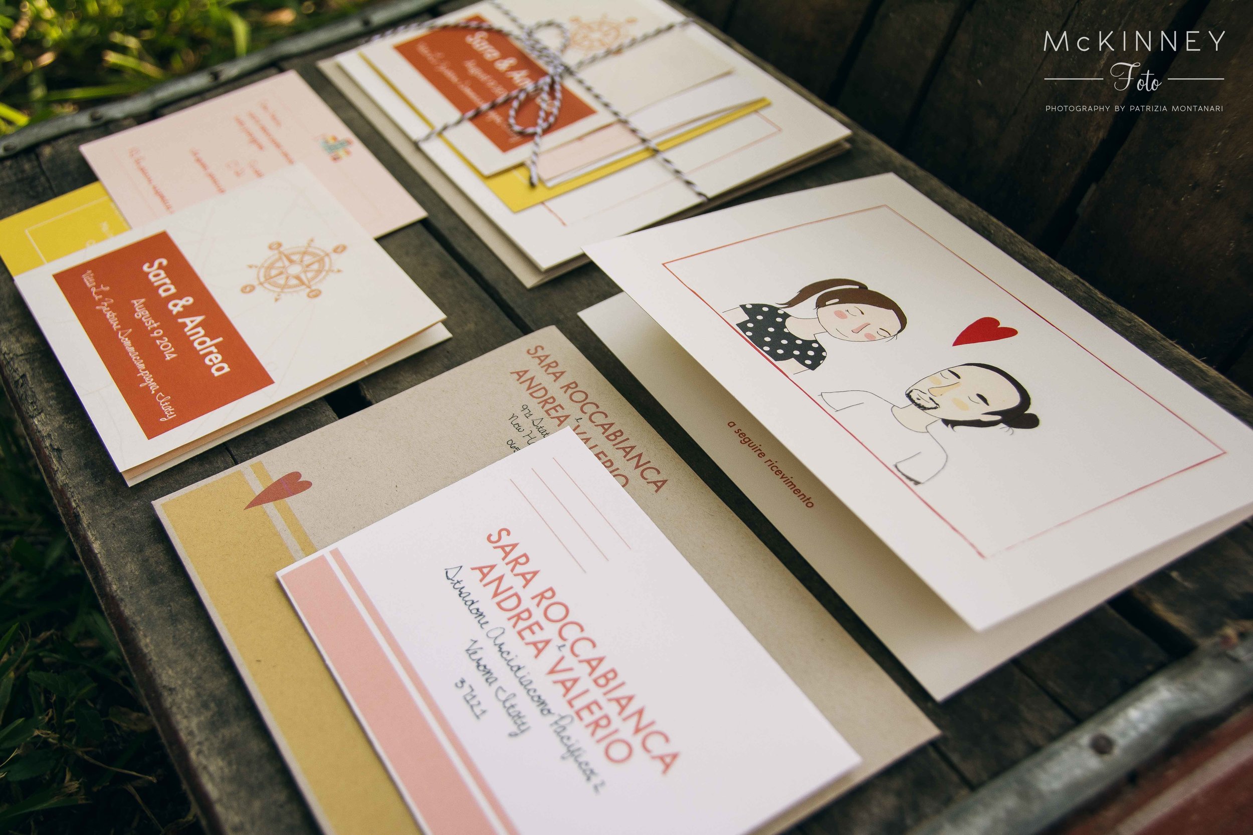
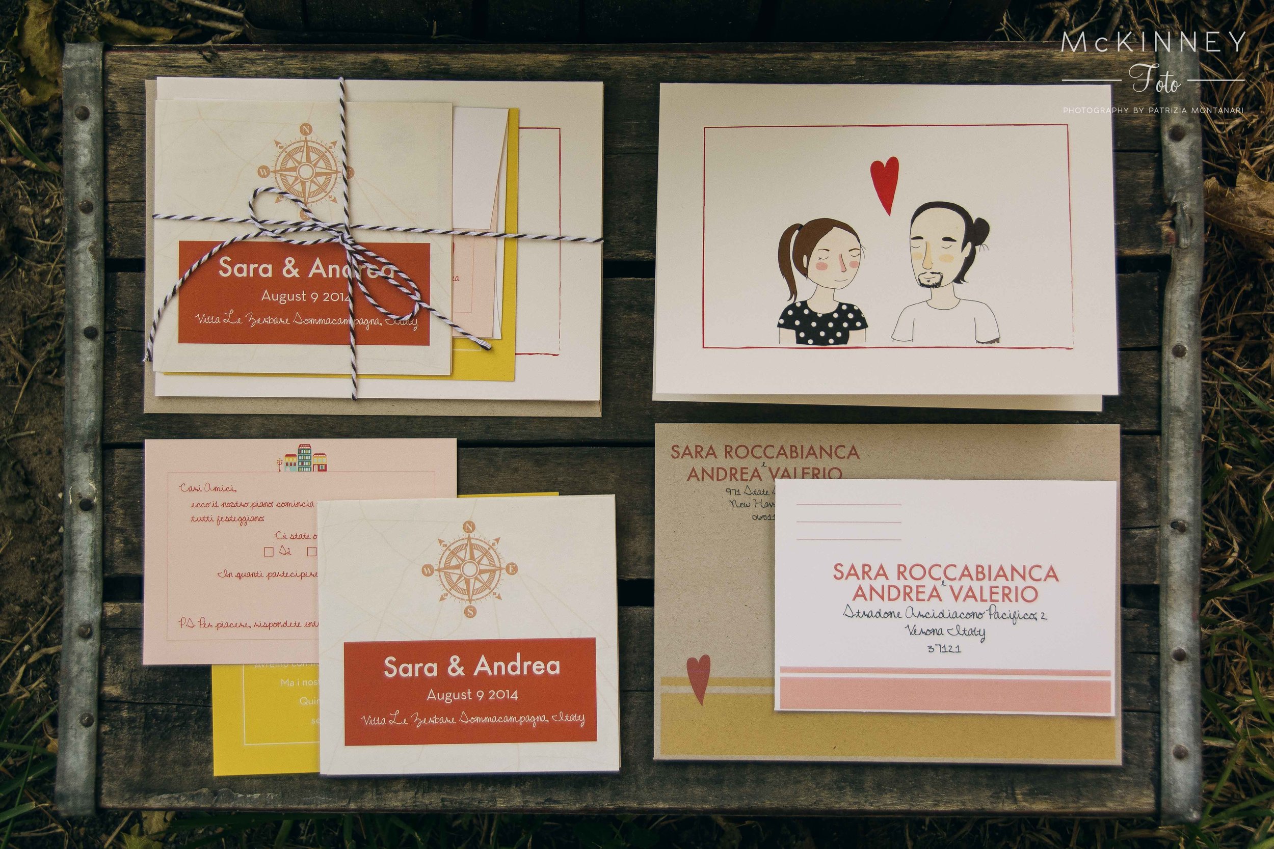
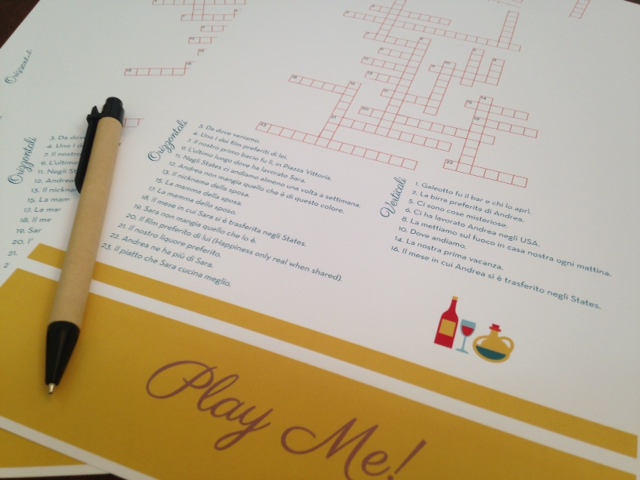
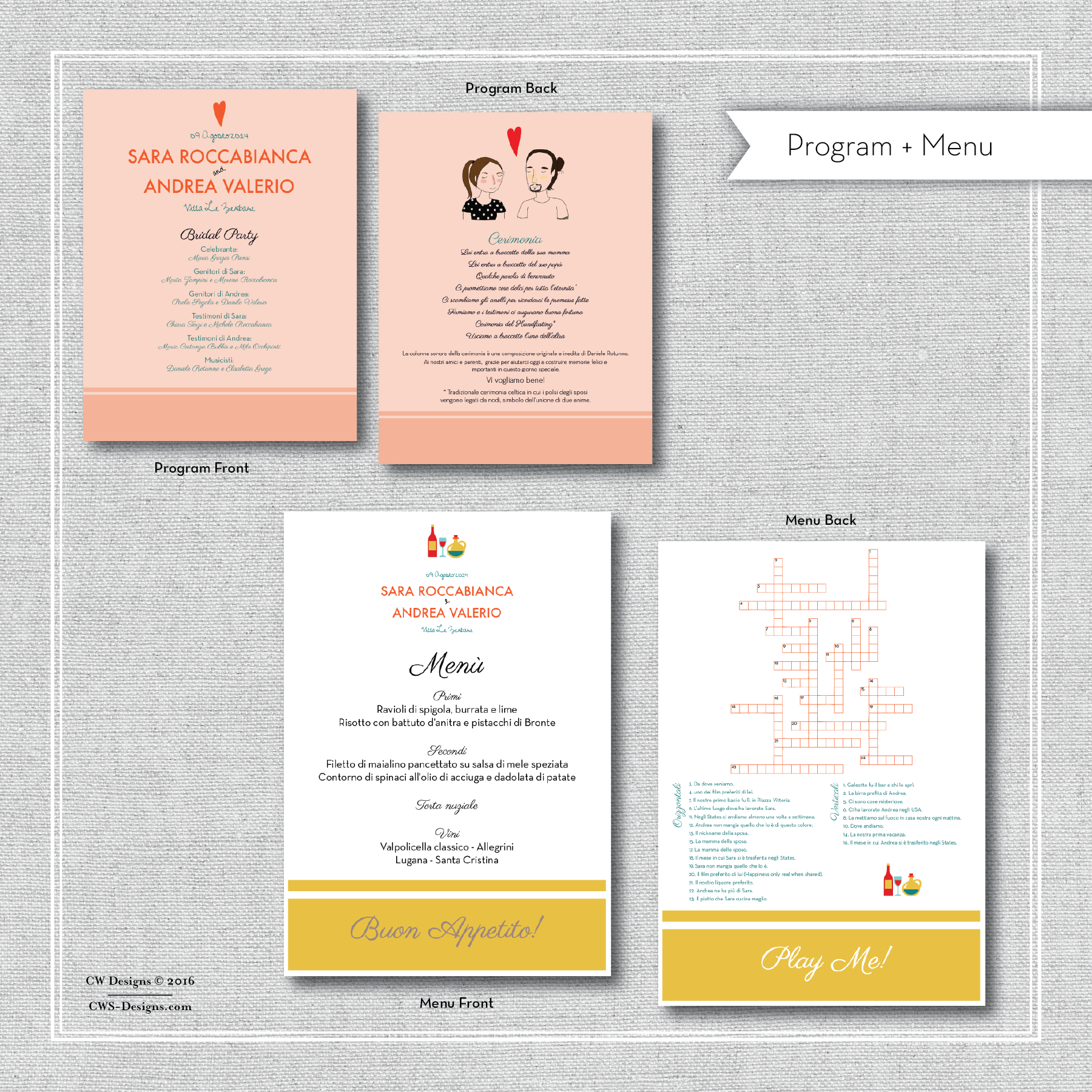
Many times when we are asked to design something inspiration derives from a painting, a flower, architecture, and even sometimes a movie. A while back we were asked by a client to design an Invitation suite based on the Wes Anderson film, Moonrise Kingdom. It's a wonderful coming of age film that captures young love beautifully. Trying to capture the beauty of the film on paper without turning it into a caricature was an initial concern, but any apprehension quickly vanished after watching the film.
Generally, using a film as inspiration can be quite challenging, but the visual style of Wes Anderson lends itself to stationery design quite well. His films utilize symmetry, a limited color palette, and often intricate details to transform what is familiar into something other worldly.
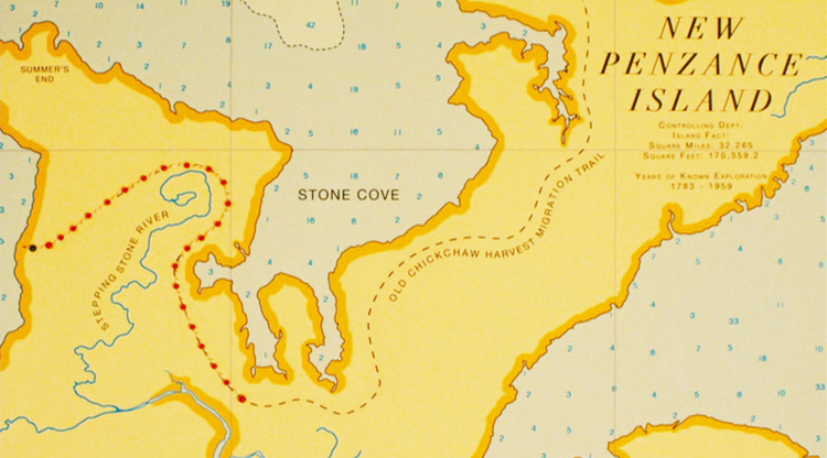
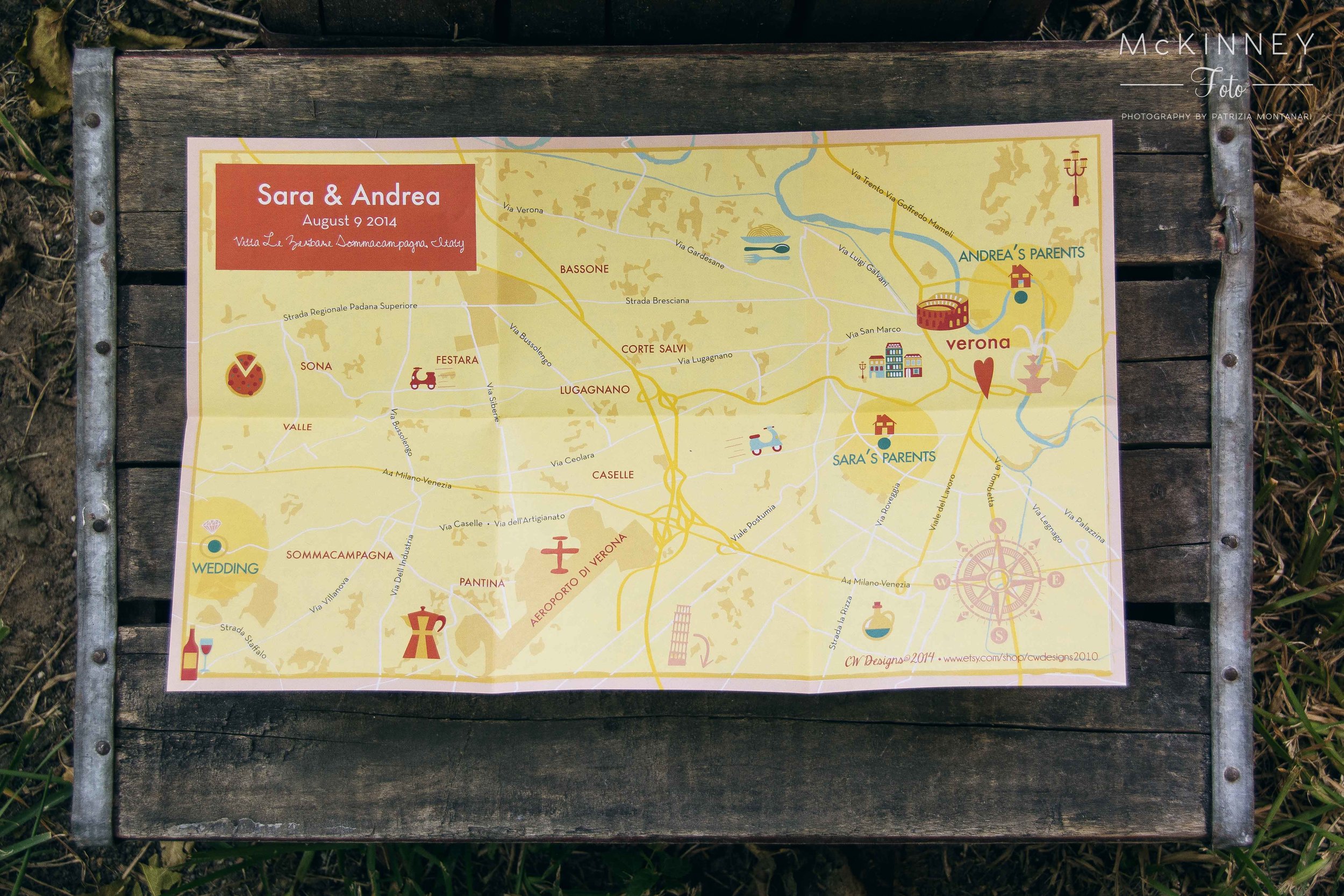
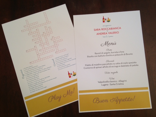
When designing this invitation suite we had to especially take into account the location of the wedding, Verona, Italy! Blending the essence of Italy with the composite beauty of Moonrise Kingdom was a challenge, but ultimately the result was a fusion of color and imagery. The map especially captures the guiding color palette for the film while nodding to the whimsical aesthetic of the film. Check out the photo's below of some of the inspiration for the suite and the final result. We absolutely love it.

